On Abstraction
Universality of abstraction in art
All art entails abstraction, as indeed does much human description and behavior. Language requires generalized terms and abstract concepts – even a dry internal memo requires abstraction. Any biography, novel, or poem engages in abstraction from actual or imagined events or emotions. When a viewer interprets that a painting illustrates Mary holding the crucified Jesus, the viewer is applying imagery of a generalized woman and of a corpse, and applying the abstract concepts of Christianity. The artist has abstracted – the figures may be larger or smaller than live figures, and the artist has likely adhered to the conventions of rendering three-dimensional figures on a flat plane.
So, abstraction is a given. What is generally called “abstract art” is the breaking of the given culture’s conventions of rendering figures on a plane. Paintings from a different culture or era will also seem abstract to our stereotypical current-day viewer. (Of course, in generalizing a “stereotypical current-day viewer” we are generalizing and abstracting from the actual experiences and sensibilities of any specific viewer.)
The call for greater abstraction
Once we recognize that our consciousness is limited and limiting, it follows that the phenomena of which we are conscious are limited. One role of artists is to explore the unconscious, and manifest elements from the unconscious so that viewers or readers might be able to lift the veil of their consciousness.
In his support of JMW Turner’s painting, John Ruskin [1973; originally written in 1843] “repudiates the rationalist philosophy of the 18th century, with its assumption that truth is timeless, abstract, and impersonal, and affirms the significance of another kind of truth, based on an awareness of historical or individual development, concrete sensuous experience, and the individual consciousness” [Kirchhoff, p.28]. “The artist's responsibility is to confront the appearance of nature, deduce its essence and retell or explain that essence in the work of art.”
“When an artist experiences reality, his aesthetic experience can be expressed as either a material depiction, or an abstract formation. Van Doesburg regarded depiction as an 'indirect' form of artistic expression; only abstract formation based on an artist's true aesthetic experience of reality represents a pure form of artistic expression, as expressed by Mondrian in all his essays.[39][40][24] “ [Overy 1991: 61-62]
Ament [2002: 86] relates that Mark Tobey once advised Paul Horiuchi “’Don’t look at nature, Paul. Feel it.’”
“Neoplasticism assumes that when the painter tries to shape reality (or truth), he never does this from what he sees (object, matter, the physical), but from what originates within himself (subject, idea, the spiritual),[59] or as Georges Vantongerloo puts it: "'La grande vérité, ou la vérité absolu, se rend visible à notre esprit par l'invisible" [The highest truth, or the absolute truth, is imagined through the invisible].[60] Mondrian calls this process 'internalization'.[7] “ [Overy 1991: 61-62]
“Non-objective” Abstraction
In 1936, Alfred Barr made the claim “The first artist to establish a system of absolutely pure geometrical abstract composition was the Russo-Polish painter Kasimir Malevich, of Moscow”. [p. 122].
Malevich first wrote the term Suprematism, in reference to his 1915 works, in a letter dated 24 September (old calendar) 1915 [Shatskikh 2012: 54]. In 1927 Malevich wrote “Under Suprematism I understand the supremacy of pure feeling in creative art [italics added]. To the Suprematist the visual phenomena of the objective world are, in themselves, meaningless; the significant thing is feeling [that[ is called forth” [Malevich, trans. by Dearstyne 1959: 67]. Tupitsyn [2019] suggested that Malevich selected the term also “as an assertion of originality and preeminence over Western movements.”
Malevich’s Suprematist paintings and drawings eschew any representation of objects, people, or landscapes, except for his own visual interpretation of the feelings that such things invoke – in him, but his writing suggests that he perceived those feelings to be widespread. Instead of visual representation, his work relies on rectilinear forms (occasionally circles or half circles) rendered in solid (or nearly solid) color (especially black, reds, and white) on a white background.
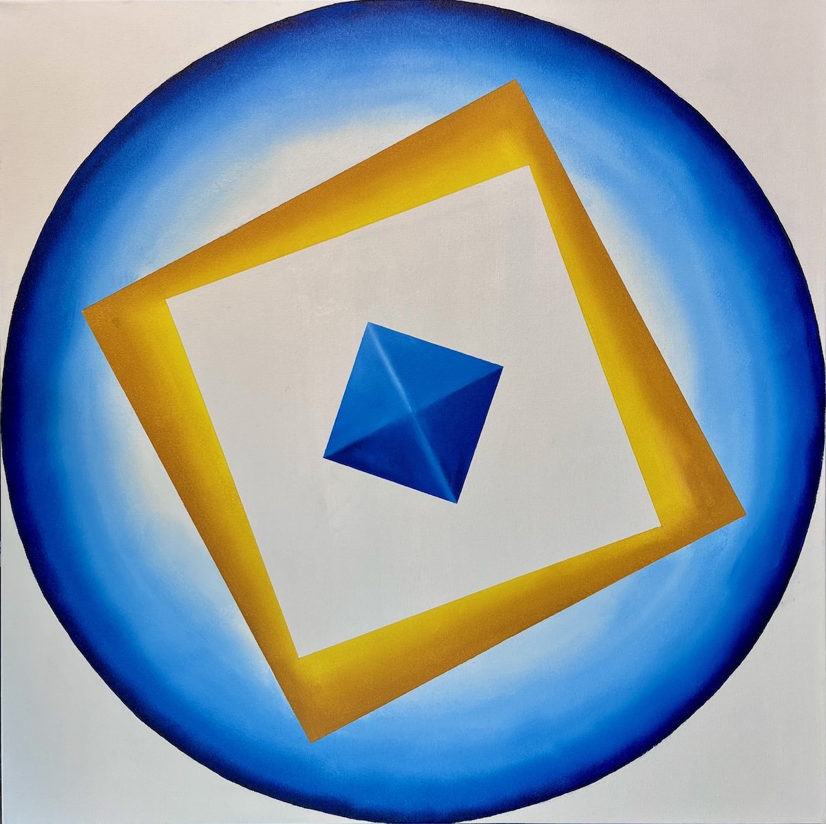
Geometric vs. Lyrical/Expressionist Abstraction
Barr [1936: 19] generalized “two main currents” of abstract art since the late 19th century:
Cézanne, Seurat Suprematism, Constructivism, Neo-Plasticism: “intellectual, structural, architectonic, geometrical, rectilinear, and classical in its austerity and dependence upon logic and calculation.
Gauguin, Matisse Kandinsky, Miro, Arp Abstract Expressionism, action painting, lyrical abstraction: intuitional, emotional, organic or biomorphic, curvilinear, and romantic in its exultation of the mystical, the spontaneous and the irrational.
However, can we say that art of any sort is irrational? Most art (of all disciplines) is rational, insofar as the artist:
has a set of goals in mind (generally, regarding responses from an audience) and works systematically toward them;
solves problems based on experience and observation; and
works with cognizance of the responses that other artworks have received;
The artist generally assumes that the intended audience will respond out of some prior experience with the genre.
At least three major movements in early-twentieth-century Europe attempted to create a common visual language for painting, sculpture, applied and graphic art, industrial design, and architecture: Russian Constructivism (1915-34), De Stijl in the Netherlands (1917-28), and the Bauhaus in German (1919-33). This ambitious goal seemed feasible because of a reliance on pure geometric forms, a reaction against florid design the late-nineteenth century, and the use of steel, concrete, and glass in architecture. Purity and beauty were sought through simple geometric forms and primary colors [Overy 1991; Jaffé et al., 1983].
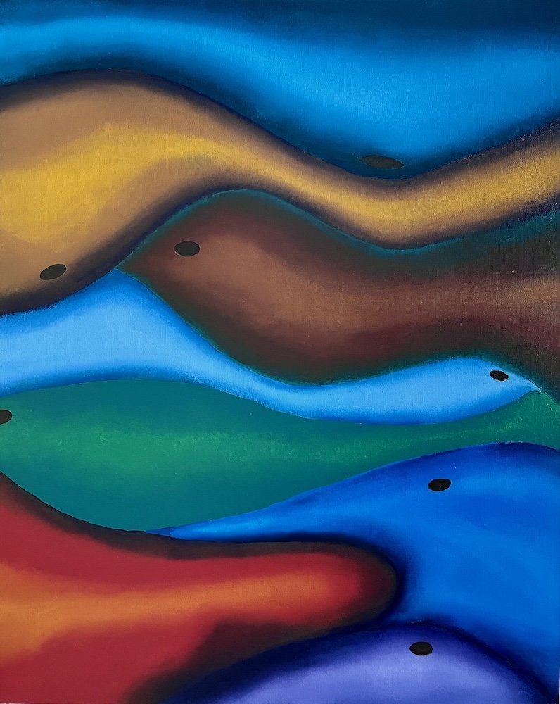
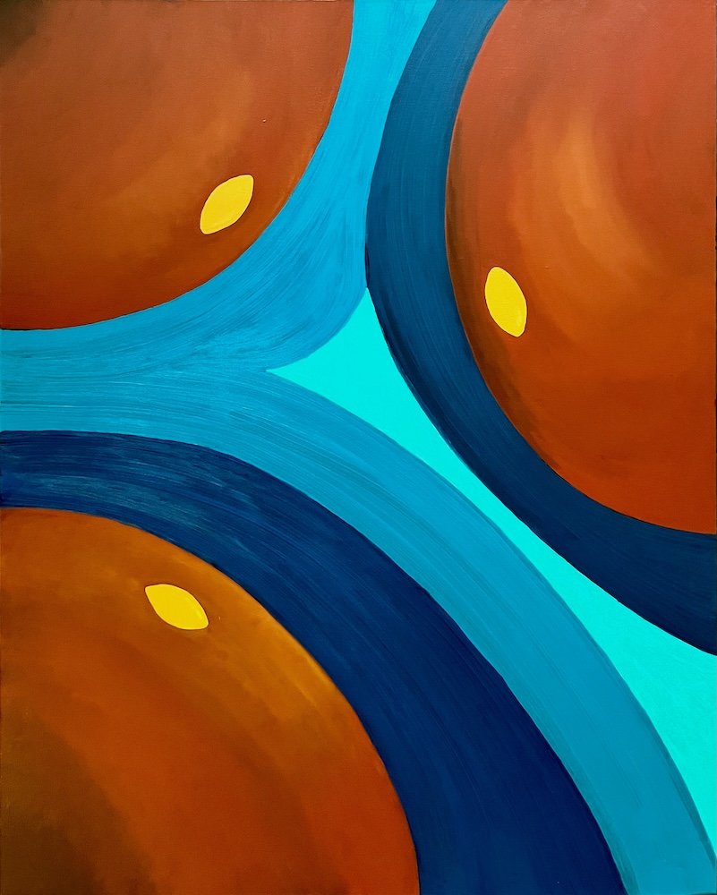
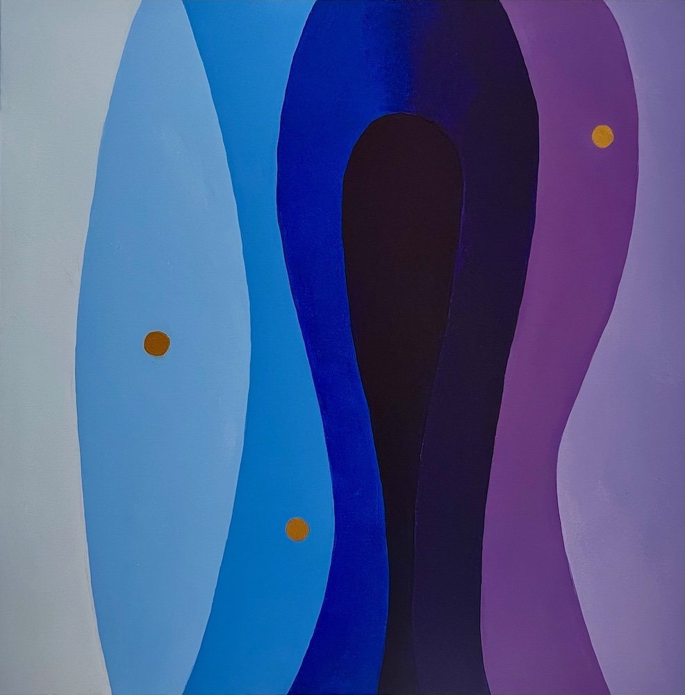
Biomorphic Abstraction
Biomorphism in visual art refers to a style where abstract forms are modeled on naturally occurring patterns and living organisms, such as cells, embryos, or plants. It emerged as a distinct movement in the early 20th century as a reaction against the rigid, mechanized world of the industrial era the geometric abstraction of Constructivism, Suprematism, and de Stijl. The movement drew from:
· Henri Bergson’s emphases on the élan vital or “vital impetus” as the source of truly new innovation and evolution, and on the superiority of intuition over intellect for perceiving the essence of reality;
· Sigmund Freud’s emphasis on the subconscious as a driver of human behavior; and
· Carl Jung’s emphasis on archetypes shared by all humans (the Self, the Persona, the Shadow, and the Anima/Animus).
In addition to the formal elements of curving and sometimes intersecting organic shapes, these philosophical and psychological underpinnings encouraged artists to engage in spontaneous modes of creation (“automatism’) that supposedly resulted from subconscious experiences or observations.
Most of my own biomorphic paintings are as rigorously planned as my geometric abstractions, but use curvilinear, seemingly organic, and irrational figures and grounds.
REFERENCES
Ament, Deloris T. 2002. Iridescent Light: The Emergence of Northwest Art. Photographs by Mary Randlett. Seattle & London: University of Washington Press.
Barr, Alfred H. 1936. Cubism and Abstract Art. New York: The Museum of Modern Art.
Jaffé, H.L.C.; Bock, Manfred; Friedman, Mildred, eds. 1983. De Stijl: 1917-1931. Amsterdam: Meulenhoff/Landshoff.Kirchhoff.
Frederick. 1984. John Ruskin. Farmington Hill, Mich.: Gale.
Malevich, Kazimir, trans. by Howard Dearstyne. 1959. The Non-Objective World. Chicago: P. Theobald. (Originally written and translated into German in 1927.)
Overy, Paul. 1991. De Stijl. London: Thames and Hudson.
Ruskin, John. 1873. Modern Painters, Vol. 1. American Publishers Corporation.
Shatskikh, Aleksandra, trans. by Marian Schwartz. 2012. Black Square: Malevich and the Origin of Suprematism. New Haven: Yale University Press.
Tupitsyn, Margarita. 2019. The subject of nonobjective art. Post (1 May). https://post.moma.org/the-subject-of-nonobjective-art/, accessed 5 Nov 2020.