Subjectivity begs the question of sources.
Read MoreNon-objective art
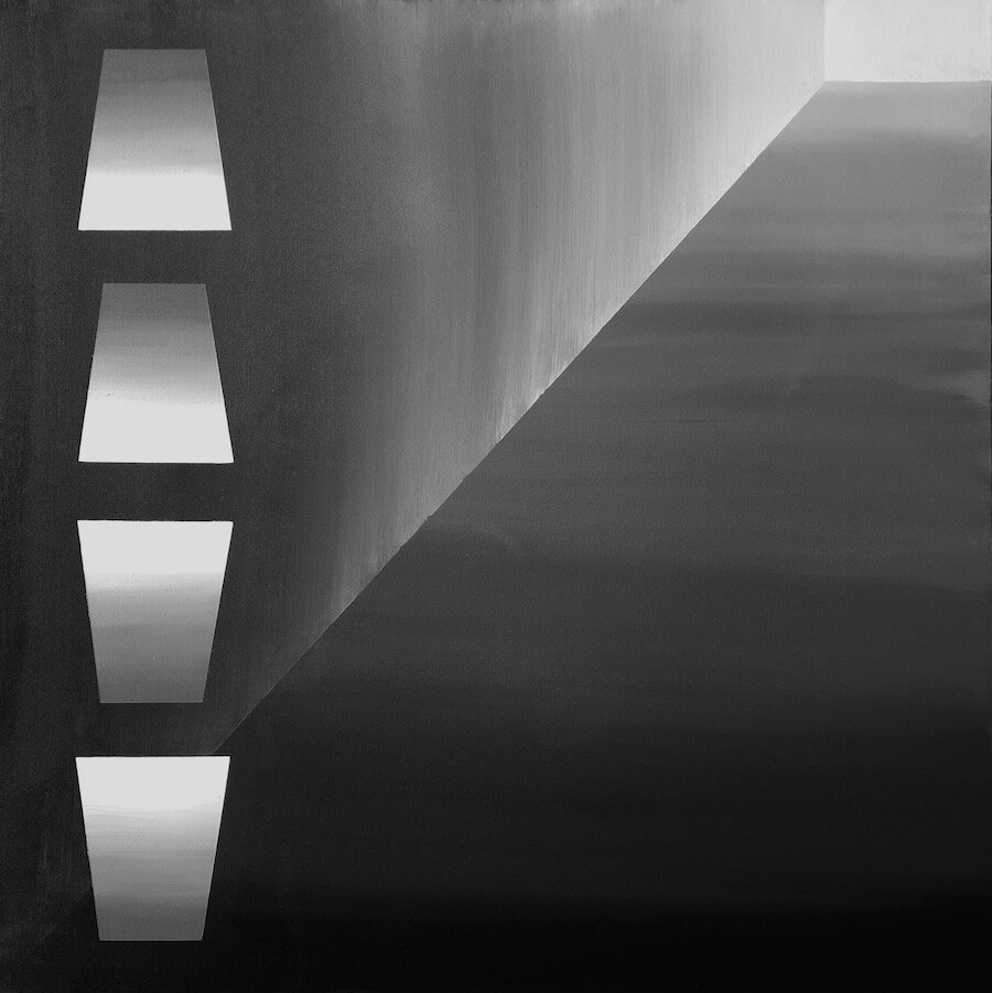
MBTW /
My goal for some compositions is to reduce or eliminate a distinction between “object” and “background.” In those compositions I try to give black, gray, and white near-equal precedence, so that one does not appear to be painted “over” the other.
Before working on the canvas, I sketch each composition – roughly at first, to develop the balance of forms and values that I want, and then in exact scale and value. Each painting is thoroughly planned. However, there is a “discovery” stage, when I study the finished painting in each of the four orientations afforded by the square canvas. I select the final orientation based on its psychological and interpretive impact.
I want to maximize the impact of each painting, but I don’t want to determine the nature of that impact. That’s why I’ve given each painting a simple numerical title. You’re welcome to develop your own, personal subtitle for each painting – I have!
Power to the viewer! /
As a painter, I want to give you the power to see whatever images, symbols, or interactions you need to see in my compositions.
This is why I decided to paint a set of 36” square canvases with a palette limited to black, white, and grays mixed from them. Thus, the variables at play were value, shape, and the combination of shapes to form a composition. From the beginning, I decided to limit my shapes to basic geometric forms: square, rectangle, line (well, not true one-dimensional lines, which would be quite invisible), and circle. This decision resulted from my 2020 reading and writing on Russian Suprematism as championed by Kazimir Malevich (1879-1935).
But if we take away the color? /
Despite my obvious love of color, I’ve started a new series of paintings that eschew color and representation, to focus on composition and implied meaning. The MBTW series https://www.jwharrington.com/mbtw currently comprises thirteen 36”x 36” canvases painted using only Mars Black and Titanium White pigments. By eliminating the associations of colors and their juxtapositions, I can emphasize the non-objective nature of the compositions. Associations abound nonetheless, derived from the interweaving of positive and negative spaces. Some have a range of shades from black to white, some are only black and white, some are dominated by dark shades, some by light or white. I absolutely don’t have a favorite among these twelve, but here’s an example of what can happen despite such a limited palette: