"MBTW" by JW Harrington

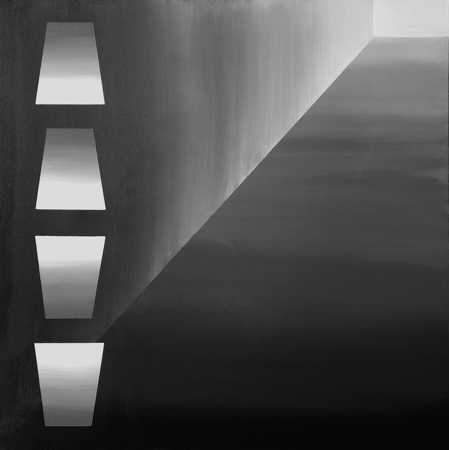
The MBTW series is named for the only two pigments used in these paintings:  Mars Black and Titanium White. 

While many of these monochromatic paintings use a range of values from black through grays to white, most of the individual geometric shapes are solid, with no value gradation within them.  To reinforce the solidity of these forms, I minimize my visible brush work by thinning the acrylic paint slightly, using long strokes that extend over the entire form, using matte finishes, and applying matte acrylic varnish across the entire completed composition.

To increase the psychological tension in the compositions, I make sparing use of symmetry.  To reduce obvious interpretation of objects, I make very sparing use of shapes that might convey visual perspective.

Power to the viewer! by JW Harrington

As a painter, I want to give you the power to see whatever images, symbols, or interactions you need to see in my compositions. 

This is why I decided to paint a set of 36” square canvases with a palette limited to black, white, and grays mixed from them.  Thus, the variables at play were value, shape, and the combination of shapes to form a composition.  From the beginning, I decided to limit my shapes to basic geometric forms:  square, rectangle, line (well, not true one-dimensional lines, which would be quite invisible), and circle.  This decision resulted from my 2020 reading and writing on Russian Suprematism as championed by Kazimir Malevich (1879-1935). 

But if we take away the color? by JW Harrington

Despite my obvious love of color, I’ve started a new series of paintings that eschew color and representation, to focus on composition and implied meaning.  The MBTW series https://www.jwharrington.com/mbtw currently comprises thirteen 36”x 36” canvases painted using only Mars Black and Titanium White pigments.  By eliminating the associations of colors and their juxtapositions, I can emphasize the non-objective nature of the compositions.   Associations abound nonetheless, derived from the interweaving of positive and negative spaces.  Some have a range of shades from black to white, some are only black and white, some are dominated by dark shades, some by light or white.  I absolutely don’t have a favorite among these twelve, but here’s an example of what can happen despite such a limited palette:

MBTW2.jpg

Remembering others, and moving forward by JW Harrington

With their holidays, May and June bring us in the U.S. to remember the mothers, grandmothers, soldiers, sailors, flyers, fathers, and grandfathers who have protected us, the enslaved people who helped build this country, and the sexual minorities who’ve suffered for who they are. These holidays draw strong emotions from many of us. 

I’ve had the temerity to paint remembrances of my own father and mother (The Impossibility of Knowing (13) and (14))

IoK (13) & (14).jpg

and of my childhood home (The Impossibility of Knowing (12)), https://www.jwharrington.com/the-impossibility-of-knowing.

IoK (12), final.jpg

In the Northern Hemisphere, May and June also call forth the beginning of summer daylight and warmth.  Thus, this season leads us to recall our origins, to remember those who’ve passed on, and to look ahead toward the light.

I’ve had the joy of painting an impression of a favorite summer scene (Summer Seascape: Iceberg Point). https://www.jwharrington.com/figurativ-paintings.

Summer Seascape (Iceberg Point).jpg

Now, at least as much as ever, we need the light!